Sunday, October 18, 2009

House In Niho II


Here is a house in Niho, designed by Ryuichi Furumoto. This is an ultra- modern house while still embodying traditional Japanese aesthetics. Furumoto says that he was trying to be "soft and kind with the concrete" with this one. Check him out, he has some pretty unique designs and his style is catchy.

Storm Thorgerson

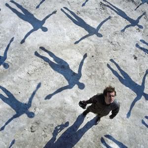
muse Pictures, Images and Photos
The story of how I came to discover Storm Thorgerson is a peculiar one, being that I had admired and even owned some of his work without knowing who he was. Thorgerson is a graphic designer from England who has created and designed some of the most interesting works of art I have ever seen, not to mention the fact that he is responsible for a few of the greatest album covers in history. The thing I like the most about his work is the recurring theme of multitudes of unusual images, providing visual evidence of the power of repetition. I first admired this theme in his work, without actually knowing of him, on the cover of an album I own, Absolution by Muse (seen above). He has also designed album covers for Led Zeppelin, Dream Theater, Audioslave, Styx, and Yes, his most famous piece of cover art being by far the one he created for Pink Floyd's The Dark Side of the Moon album. For more of his iconic work, you can visit his website at http://www.stormthorgerson.com/.

Visual Acoustics: The Modernism of Julius Shulman

Visual Acoustics, a documentary narrated by Dustin Hoffman, follows the career path of the late Julius Shulman. Shulman is considered by many to be the greatest architectural photographer of all time. His work is viewed as capturing the true spirit and beauty of modernist architecture. Possibly the most famous and recognizable photo of his is entitled "Case Study House #22" and can be seen at :20 into the trailer. The film was released at Cinema Village in New York on October 9 and the Nuart Theatre in Los Angeles on October 16.

Saturday, October 17, 2009

Top Designers under 40


Check this out and email me some thoughts and feedback. Top Designers under 40. Click here

Monday, October 12, 2009

This was the first version of the "Quench" project. It is comprised of magazine clippings that I cut out and glued together. I liked the horizontal nature of the images and I wanted to focus on the elephant in the bottom right corner quenching its thirst. The large grey shape in the middle is a dehydrated rose. It grabs attention and complements the destitute desert background. I wanted to mount it all on a black, or dark, background. These images were selected from a many other clippings and came together slowly. I maintained the horizontal direction of the images and tried to complement what I had done by hand with what I had done on the computer. I also had to rework the colors so that it would print properly. However, in the end, the color complements the images in a way that I did not intend.
This is the final version of my project. I edited it in photoshop. I maintained the original images although I did away with the tents and the wrinkles in the paper that were an inevitable product of wet glue. I made everything brighter because the printer wasn't calibrated at the time, however, the color combination worked out. The repitiion of the words in the background also contributed to the ultimate message, "Quenching thirst." Also the difference in color of one line of text draws attention to the image of the elephant and distinguishes as something essential to the message of the images.

Monday, October 5, 2009

Portable Globe House


So...They tried this in the 1960s. They probably envisioned the "future" as 2010. Progressive thinkers? Read the January 1961 article published in Science and Mechanics... article

Spherical, rotating, self-sufficient houses


Since this idea is currently being explored in D&C class, I checked out some related designs and thought this would be a start to a discussion on the practicality and potential of such an idea...
www.saturnliving.com